
Great logos aren’t easy to create. Even the most simple logos often involve an entire team of experts generating concept after concept before one direction is chosen to move forward.
There’s so much to consider — the visual side (colour palette, typography, pictorials, etc.) as well as the marketing and psychological side (how the logo will appeal to its target demographic).
Below are my top tips for clients to keep in mind when setting a brief for their company’s logo design.
Keep it simple.[vc_separator type=’transparent’ position=’center’ color=” border_style=” thickness=’10’ up=” down=”]
There’s a world of difference between simple and basic.
Simple is effective. Simple communicates succinctly. There’s a lot of research and planning that goes into something simple. Simple captures everything a brand stands for in one iconic mark.
Basic is half-assed.
We’ve all seen logos (and even websites for that matter) that look like they’ve been designed by amateurs. How many iconic successful logos have been created by someone with no professional design experience? Find me one and I’ll eat my keyboard.
Basic design is often someone just laying out some text, picking a font and colour and maybe including a picture. Often with messy results.
I’ve designed many logos that have been purely one or two words in black type – no imagery or colour. Some people may think “surely anyone could do that in Microsoft Word?” but I didn’t just smack some words down and pick a font. I interviewed the client to learn how they wanted their brand to be perceived, researched the brand’s competitors, looked for typefaces that convey the upper-class sophisticated aesthetic the client wanted, paid for a licensed font, and altered the type until it was perfect. The final product wouldn’t have looked out of place next to Chanel or Dior’s logos.
The physical brand logo may be the tip of the iceberg but the thought that went into it is the bit that’s underwater.
That’s what simple is.
The types of logos.[vc_separator type=’transparent’ position=’center’ color=” border_style=” thickness=’10’ up=” down=”]
There are essentially four different types of logo designs:
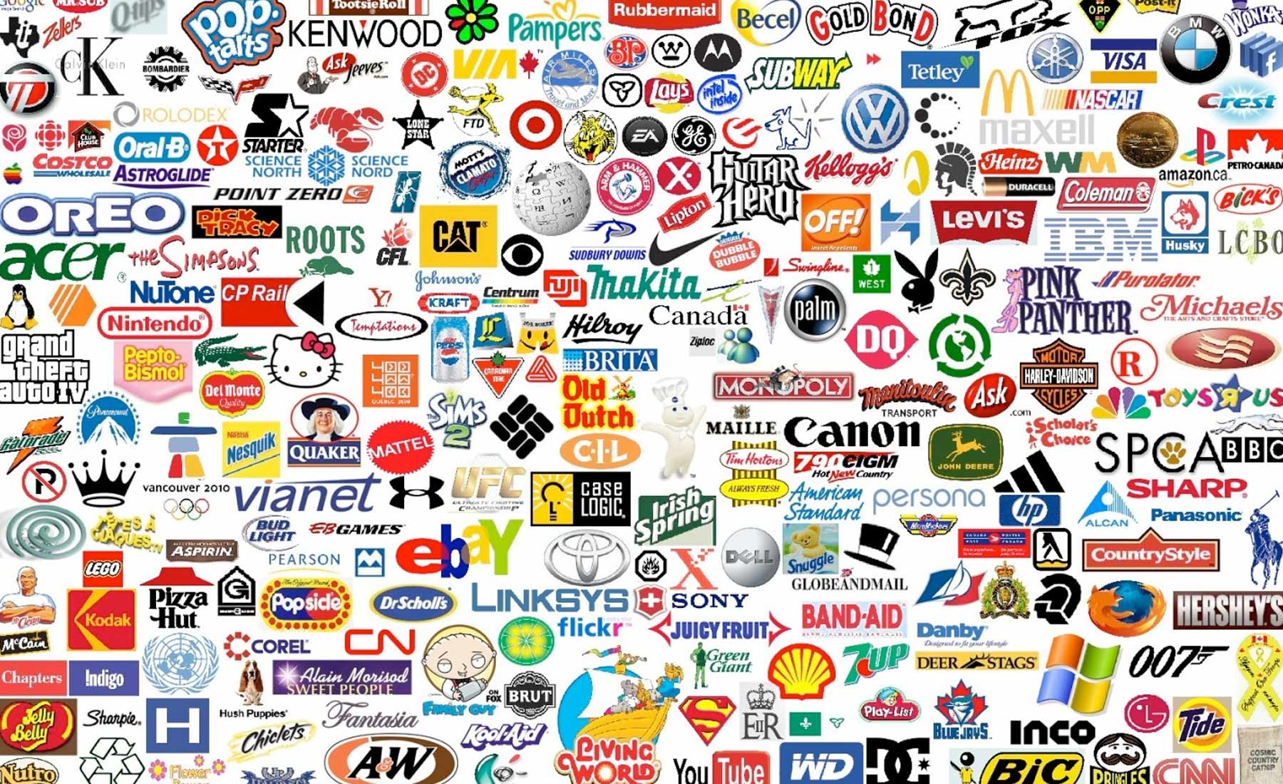
- Wordmarks – Logos that are purely text (e.g. Google, eBay)
- Letterform – Logos that consist of one or two letters (e.g. McDonald’s, Louis Vuitton)
- Pictorial – Logos that have an icon/visual (e.g. Twitter, Apple, Target)
- Abstract – Logos with brand marks that don’t represent anything (e.g. Nike)
The choice of which logo to go for will vary according to each brand. It depends a lot on what the product or service is, the business name and the target market.
What the logo should convey.[vc_separator type=’transparent’ position=’center’ color=” border_style=” thickness=’10’ up=” down=”]
A logo should provide an immediate sense of what a company is about.
When people look at it, they should get a feel for the brand’s personality and feel assured that the brand is professional and successful.
Simply, that’s it.
Colour palette.[vc_separator type=’transparent’ position=’center’ color=” border_style=” thickness=’10’ up=” down=”]
Logo colour is very important. See my post What a Logo Colour Says About Your Business where I go into detail about how each colour plays a role in conveying a message to customers and how to choose the best colour/s to represent your business.
Your place in the market.[vc_separator type=’transparent’ position=’center’ color=” border_style=” thickness=’10’ up=” down=”]
A vital part of any business (not just for the logo design aspect) is to know where you stand in the market.
You should know exactly who your customers are, and what makes them want your product or service.
You know who your direct and indirect competitors are, and what you have to offer that no other business currently does.
This knowledge will equip you for success in all aspects of business life and ensure you have a logo that successfully engages with your target market.
Longevity.[vc_separator type=’transparent’ position=’center’ color=” border_style=” thickness=’10’ up=” down=”]
You shouldn’t keep the same logo forever, but you also shouldn’t completely change it every few years.
The key is to do a refresh after five or ten years to keep it looking current.
A great example of this is Shell:
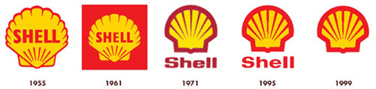
They’ve kept the concept and colour palette the same, but performed small tweaks over the decades to create a brand presence so strong and recognizable, they don’t even need to write their name underneath anymore.
Completely redesigning a logo is foolish. It greatly weakens a brand’s identity and your customers won’t recognise you. I’d only recommend it if a business is failing and requires a complete reinvention.
Otherwise, follow the 20% rule – tweak up to 20% of your logo to remain current. Be like Shell. And Pepsi. And Apple. And BMW. The list goes on.
Great post
Thanks a lot for this post!