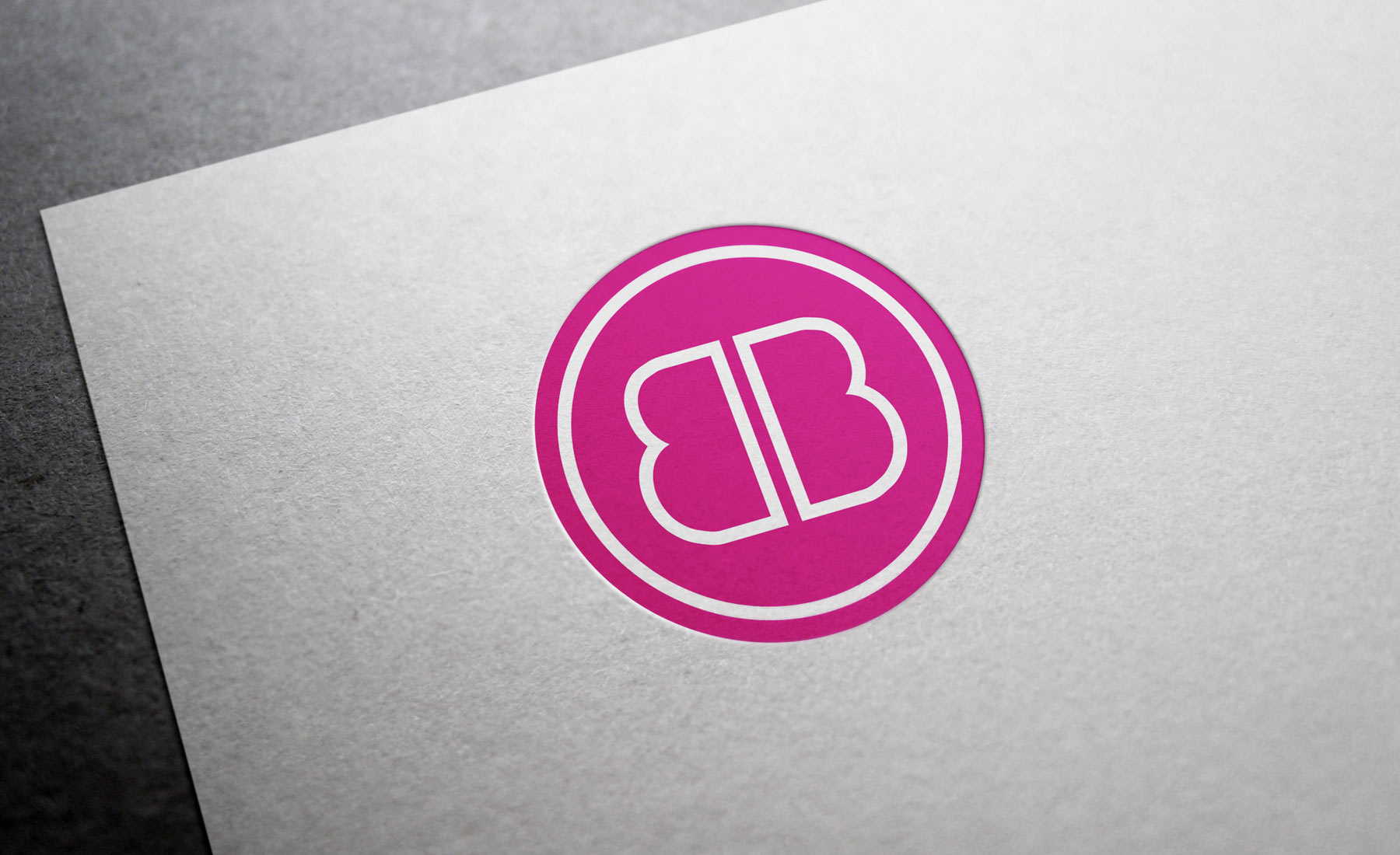
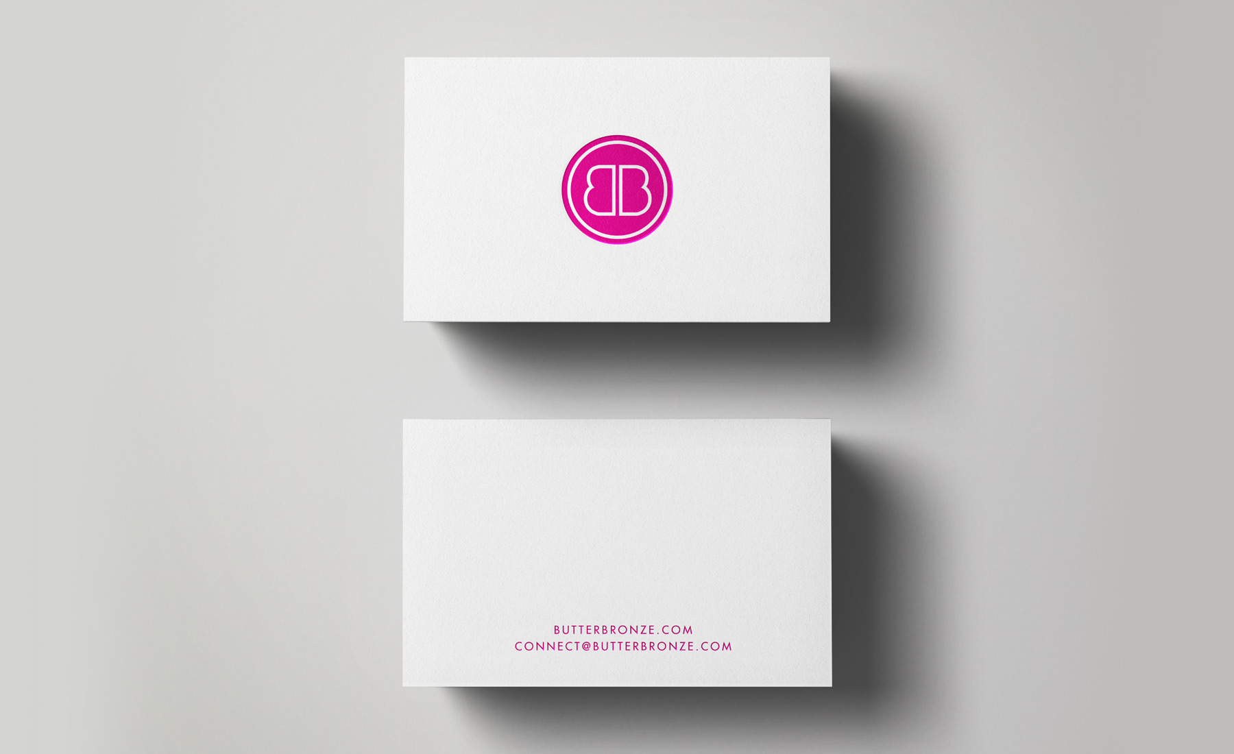
Butter Bronze required an emblem-like brand mark to be created that plays with the two B’s in the company’s name. The single-colour emblem could be used in various hues depending on the season or campaign, and it was even made into a stamp for a cost-effective branding solution.


